 |
| The Bad sleep well by Akira Kurosawa |
" The Bad Sleep Well was a fun one. Probably the most minimalist set of designs I’ve ever turned in, especially considering I basically put all my eggs in one basket with this one concept that I latched onto pretty early."
Link agli appunti di Eric.
---------------------------------------------------------
 |
| Yi Yi by Eward Yang |
"In our initial discussions about the film, producer Curtis Tsui and I both immediately recognized Yang Yang’s penchant for photographing the backs of people’s heads as one of the most potent visual metaphors in the film.Unfortunately, we didn’t have any high-resolution art from the film that represented that idea. So we decided to try to reproduce it."
Link agli appunti di Eric.
---------------
 |
| The Furies by Anthony Mann |
"Since this was the first "real" Western in the Criterion Collection we felt it was important not to downplay the genre elements. But at the same time, it's a somewhat atypical Western, very dark in tone, so we didn't want to present it as something it's not. The Furies is often referred to as a "noir western," so I decided to try to combine the visual styles of those two genres. Once I found that hook to hang the design on, it was really just a question of execution".
Link agli appunti di Eric.
--------------------------------------------
 |
| Three war films Andrzej Wajda |
Link agli appunti di Eric.
-------------------------------------------
 |
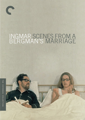
| Scenes from a marriage by Ingmar Bergman |
"I still dig the way the title and Bergman’s name interlock, though it’s probably overstepping my purview to suggest so strongly that the film represents scenes from Bergman’s marriage. I have no idea what Bergman’s marriage is like; I hope it’s very happy and not particularly like the tumultuous relationship in this film".
Link agli appunti di Eric.
-------------------------------------------------
 |
| Hands over the city by Francesco Rosi |
"We wanted to find a way to get Rod Steiger on the cover—he's a recognizable face, after all, and this was kind of a lesser-known film. Luckily, there was an easy way around that, since one of the major motifs in the film is Nottola's campaign posters. The other repeated visual motif in the film is the enormous city planning map in Nottola's office, which is obviously a pretty good way to reference the importance of the city".
Per questo lavoro Eric si avvale della collaborazione dell'artista croato Danijel Zezelj di cui vi consiglio caldamente di andare a vedere i suoi lavori.
Link agli appunti di Eric.
FINE PARTE II


Nessun commento:
Posta un commento